I’ve been designing responsive websites for over a decade, and one thing has become abundantly clear: responsive design isn’t just a technical nicety. It’s the foundation of digital success. In today’s fragmented device landscape, your website must perform flawlessly regardless of screen size, or you risk losing visitors before they even engage with your content.
My experience has shown me repeatedly that websites failing to adapt properly create immediate friction. Just last year, I worked with a local Sarasota retail chain whose desktop-optimized site was driving mobile users away in droves. Their bounce rate exceeded 70% on smartphones! After implementing the responsive design principles I’ll share with you today, that number dropped to under 30%, and their mobile conversions increased by 115%.
Let me guide you through the responsive web design considerations that truly matter for businesses seeking online growth. This isn’t just theory, it’s battle-tested knowledge that my clients have used to transform their digital presence. For companies aiming to grow their brand and customer base, investing in professional custom web design is a key step to ensure every element works seamlessly across devices.
What is Responsive Web Design?
Responsive web design (RWD) means building websites that automatically adjust to fit the screen size and resolution of whatever device is accessing them. The technical backbone involves CSS media queries and strategic breakpoints that apply different styling rules based on device characteristics like width, height, or orientation. These responsive web design considerations help Sarasota businesses get the most out of the promise of their website.
This approach differs significantly from merely being mobile-friendly. While mobile-friendly sites might offer simplified layouts for smartphones, they often maintain separate codebases for different devices. It creates maintenance headaches and inconsistent experiences. Adaptive design takes a different approach by selecting from predetermined layouts for particular devices, which can create jarring transitions as users move between screen sizes.
The distinction matters deeply because responsive design delivers the consistency essential for building trust. With over 60% of web traffic now coming from mobile devices in the U.S., and 77% of American adults owning smartphones, ignoring device diversity means alienating most of your potential audience.
The business impact is substantial: properly implemented responsive designs enjoy 22% lower bounce rates and 11% higher conversion rates on average, alongside a 20% improvement in overall engagement. From an SEO perspective, Google’s mobile-first indexing makes responsiveness a ranking necessity, not just a preference. This is why SEO-friendly design strategies matter so much to overall online success.
Breakpoints for Diverse Devices and Orientations
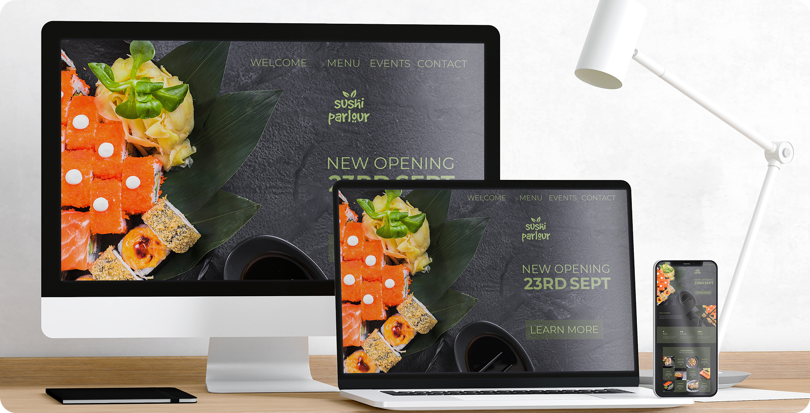
In a recent project for a financial services client, I discovered that their standard breakpoints weren’t accounting for tablet users in landscape mode. That resulted in a significant portion of their audience abandoning complex forms. By adding an orientation-specific breakpoint at 1024px with specialized layouts for landscape mode, we increased form completion rates by 28%.
Common responsive breakpoints include:
- Mobile portrait (320–480px)
- Mobile landscape (480–640px)
- Tablet portrait (768px)
- Tablet landscape (1024px)
- Desktop (1200px and above)
But the magic happens when you move beyond generic widths and consider how content should transform based on both screen size and orientation. For instance, navigation menus might collapse into hamburger menus on mobile portrait view but display as abbreviated horizontal menus in landscape mode, maximizing the available space without sacrificing usability.

Embracing a Mobile-First Design Approach
I converted to mobile-first design after witnessing its transformative impact on a client’s e-commerce site. Starting from mobile forced us to prioritize only essential content and functionality. When we expanded to larger screens, we added richer features in logical progression. The result was a more focused experience on every device.
This progressive enhancement approach aligns perfectly with Google’s indexing priorities. It also eliminates the costly mistake of designing elaborate desktop experiences that later prove impossible to translate effectively to mobile. Furthermore, custom responsive web design makes your website more effective and increases your search engine metrics.
One manufacturing client who insisted on desktop-first design ended up spending 40% more on development as we struggled to retrofit complex interactive elements for smartphone users. It was a challenge to implement cross-device compatibility as a result. The lesson was clear: start small and build up, not the other way around.
Content Prioritization and Intelligent Hiding
The limited real estate on mobile screens demands ruthless content prioritization. For a tourism client, we implemented progressive disclosure techniques that revealed detailed information only as users signaled interest through interaction, reducing cognitive load while maintaining access to comprehensive content. This isn’t about simply hiding content on mobile (which can create SEO problems if done incorrectly). Instead, it’s about understanding the different contexts and goals of mobile versus desktop users and structuring information hierarchies accordingly.
In practice, this means:
- Keeping primary calls-to-action consistently visible across devices
- Using collapsible sections for secondary content on mobile
- Ensuring navigation patterns match the usage patterns typical of each device type.

Visual Content Optimization
Images often constitute the largest portion of page weight, making them critical to responsive performance. It’s something that creates a challenge for mobile-friendly web design.


Image Optimization Strategies
For a photography portfolio site I designed, implementing responsive image handling cut mobile load times by 62% while maintaining visual quality. The techniques included:
- Implementing the srcset and sizes HTML attributes to serve appropriately sized images to different devices
- Compressing images without visible quality loss using modern formats like WebP with fallbacks
- Cropping images to focus on key subject matter for smaller screens
These techniques directly improved the site’s Core Web Vitals scores – Google’s key performance metrics that influence search rankings. The client saw a corresponding 18% increase in organic search traffic within three months of implementation.
SVGs Over Raster Graphics for UI Elements
When redesigning a tech company’s interface elements, we replaced all PNG icons with SVGs, resulting in sharper visuals at every scale and a 15% reduction in total page size. SVGs maintain perfect clarity regardless of screen resolution or pixel density.
Beyond the visual benefits, SVGs can be styled and animated with CSS, creating more engaging interactive elements without additional HTTP requests. This approach has become standard practice in my responsive projects because it simultaneously improves aesthetics, performance, and flexibility.
Designing for Touch: Large Clickable Areas and Whitespace
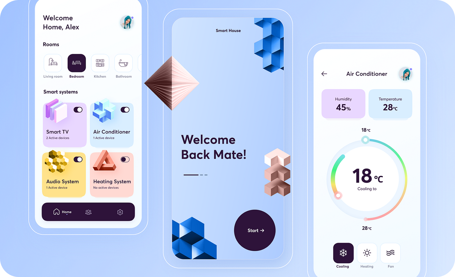
After watching actual users struggle with a client’s navigation menu during usability testing, I redesigned all interactive elements with a minimum touch target size of 44×44 pixels (following Apple’s guidelines) and added additional padding between clickable items.
This simple change reduced mis-taps by 37% and dramatically improved the mobile user experience. The principles of Fitts’s Law, which states that the time required to move to a target depends on the distance to and size of the target, are especially critical on touch interfaces where precision is limited.

Tools and Testing for Responsive Web Design
The complexity of responsive design requires specialized tools and rigorous testing.
UXPin and Merge Technology for Prototyping
On a recent healthcare portal project, our team used UXPin’s Merge technology to synchronize design components with the development codebase. This allowed designers to work with the actual responsive components that developers had built rather than creating static approximations.
This approach eliminated the all-too-common “design drift” where the final implementation differs from the designer’s vision due to technical constraints. By the time we reached development, everyone had already seen and approved how the design would behave across breakpoints, cutting revision cycles by 40%.
Google Mobile-Friendly Test and SEO Checklists
For every site I launch, Google’s Mobile-Friendly Test serves as a final quality gate, catching issues like tap targets that are too close together or content wider than the viewport. SEO-friendly website design is more than making your site crawlable by search engine bots.
My team uses a comprehensive technical SEO checklist that includes:
- Mobile usability verification
- Page speed optimization for all device types
- Proper implementation of structured data
- Confirmation that all content is accessible regardless of device
Last year, a client’s site failed several of these checks during pre-launch testing. After addressing the issues, their mobile organic traffic increased by 22% compared to their previous site. This demonstrates the direct SEO impact of responsive best practices.

Responsive Web Design Examples and Case Studies
Let’s examine how leading organizations implement responsive design principles.
The Guardian’s Mobile-First News Website
The Guardian’s website exemplifies excellence in responsive design. When I analyzed their approach for a media client, I noted several key strategies worth emulating:
- Their content maintains consistent hierarchy regardless of device
- Navigation transforms intelligently based on screen size
- Images and typography scale proportionally without breaking layouts
- Load times remain quick even on mobile connection
The Guardian’s commitment to responsive excellence has helped them maintain their position as one of the most-read news sources online. They achieve this despite industry-wide challenges in digital publishing.
This approach eliminated the all-too-common “design drift” where the final implementation differs from the designer’s vision due to technical constraints. By the time we reached development, everyone had already seen and approved how the design would behave across breakpoints, cutting revision cycles by 40%.
Smashing Magazine’s Adaptive Blog Experience
Smashing Magazine, a leading voice in web design, practices what they preach with a responsive site that thoughtfully adapts to different reading contexts. Their approach to navigation is particularly noteworthy. It works by collapsing into an efficient menu on small screens while expanding to showcase content categories on larger displays.
This intelligent responsiveness supports different reading behaviors: mobile users scanning for specific articles versus desktop users browsing categories and discovering related content.
Lookout’s Service Onboarding Across Devices
Lookout’s site maintains consistent calls-to-action throughout the user journey regardless of device, creating a seamless path from initial interest to conversion. I’ve used their approach as a case study when designing conversion-focused sites for service businesses.
Their success demonstrates how responsive design directly supports business goals when strategic considerations like user journey and conversion path inform technical implementation.
Minimalism to Optimize Speed and Usability
A law firm client approached me after their previous designer had created a visually impressive but sluggish site filled with animations and decorative elements. By adopting a minimalist approach focused on typography, strategic whitespace, and purposeful imagery, we cut load times in half while actually improving the perception of professionalism.
This experience confirmed Antoine de Saint-Exupery’s wisdom that “perfection is achieved when there is nothing left to remove.” In responsive design, this minimalist philosophy creates faster, more usable experiences across all devices.
FAQs on Web Design Sarasota
What are the essential breakpoints for responsive design?
While common breakpoints include 320–480px (mobile portrait), 480–640px (mobile landscape), 768px (tablet portrait), 1024px (tablet landscape), and 1200px+ (desktop), I recommend analyzing your audience’s actual device usage. For a recent B2B client, we discovered a significant portion of users on 1366px laptops, leading us to add a custom breakpoint that improved their experience considerably.
How does responsive design improve SEO?
Google explicitly favors mobile-friendly, fast-loading sites, with responsive design addressing both priorities. A unified URL structure avoids duplicate content issues, and the performance benefits of proper responsive implementation support Core Web Vitals, which are key ranking signals. For a local business client, shifting to responsive design contributed to a 32% increase in organic search traffic within six months.
How do responsive images improve site performance?
By serving appropriately sized image files to each device using srcset and sizes attributes, responsive images can reduce data transfer by 60-80% for mobile users. This dramatically improves load times and reduces bounce rates. A client’s product gallery page saw conversion improvements of 24% after implementing responsive image techniques.
Why is mobile-first design important?
Mobile-first design forces prioritization of content and features, ensuring performance and usability for the majority of users who access sites on smartphones. It aligns with Google’s mobile indexing priorities and creates a solid foundation for progressive enhancement. When I’ve implemented mobile-first design for clients, they’ve consistently seen improved engagement metrics and search visibility.
What tools help test responsive websites?
Beyond Google’s Mobile-Friendly Test for basic usability checks, I rely on Chrome DevTools for device emulation during development, BrowserStack for testing across multiple real devices, and PageSpeed Insights for performance analysis. UXPin with Merge technology has proven invaluable for maintaining design integrity throughout the responsive development process.